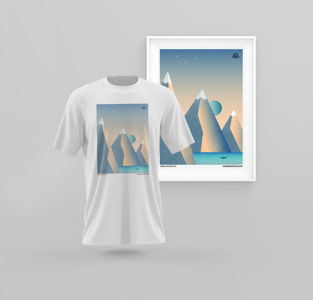
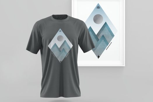
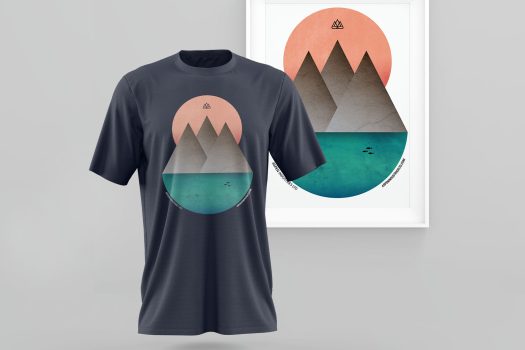
As I was looking into the business location, I was instantly inspired by it’s beautiful nature. Looking from this afar, I understood how their logo was created.
So I tried to make an artwork based on such amazing landscapes, all while sticking to the brief where they insisted it had to be minimalistic.
Everybody obviously started working with the mountains in mine, but I noticed that nobody was working with the fauna, so I took my shoot with that in mind.
I found that the Red tailed Hawk reigns on Calgary’s sky and usually can be seen on their big mountains. This bird symbols strength and victory and gives a sense of epic and manliness to the entire piece.
I took colors directly from a few pictures of the place. Gray mountains over a green lake can be seen in this place.
I added the logo as a signature in the right corner (so it can be easily seen) and the name and website at the bottom to close out the piece.
I finished in the TOP 3 but they choose another design as the winner. Miles contacted me shortly after and bought all the pieces since they wanted to frame them and hang them in the office instead.
I finished in the TOP 3 but they choose another design as the winner. Miles contacted me shortly after and bought all the pieces since they wanted to frame them and hang them in the office instead.


