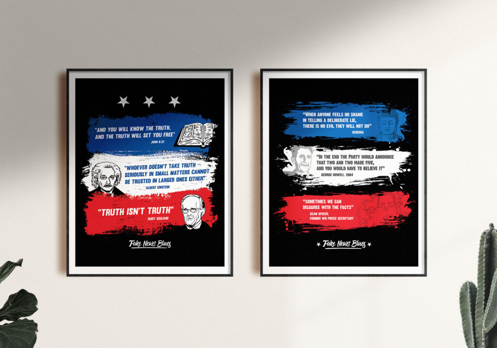
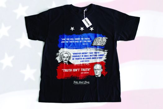
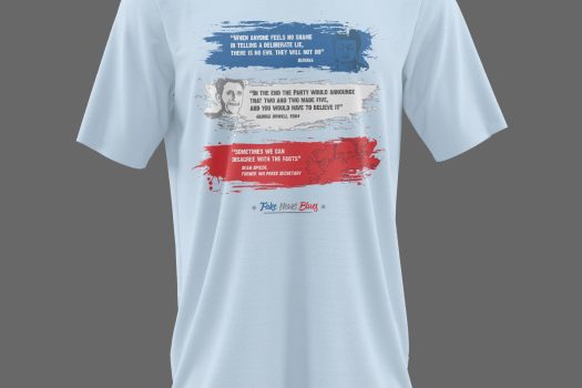
Using the reference they had, I noticed they liked illustrations with a grittiness effect technique added on, which is often used in t-shirt designs to make the ink’s natural decay over time look intentional.
Since most of these contests don’t last more than 2 or 3 days, it’s limited the amount of time I can use as a training/recreation. I chose to do a simple one line stroke to draw the authors.
It took some time, but I found some images of John that I could use, and then imagined the rest to achieve a one-color draw that doesn’t take away a lot from the text. In the same way, Einstein drawing instantly makes a visual impact since everybody knows him, and then they can read the rest of the t-shirt to understand the concept behind it. It’s either that or Rudy Giulani’s phrase, which I intentionally made bigger than the others, not only because of the length but to make it more important.
They didn’t have a logo, so I tried some options for the kind of font they’d want. We ended up choosing a script one, to kinda match with the rest of the drawings. And it has that “Blues” groovy vibe to it, too.
They had good success with this print, so they commissioned me for another one later that year.


