I was invited to this contest, and as an avid Futbol fan, I was thrilled to participate.
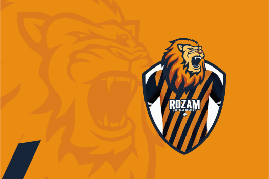
For my proposal I wanted to make a menacing lion illustration that could be also used as an emblem according to football environments. I wanted to really capture the growl of the king of the jungle! So then I started thinking how the Lion would be as a player. I watch and play lots of Futbol and when a player gets the nickname of “Lion”, usually is a hard-nosed defender or back midfielder. I wanted to embed that very essence on the logo so I designed a shirt mockup that would go well with the Lion’s head and then used it to make the shape of the emblem/shield at the same time.
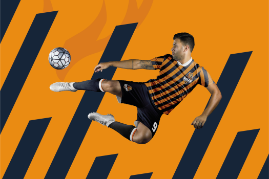
I decided to use Orange shades just like the original isologo, and combined them with a Dark Blue to make a nice looking pairing. Even tho the main logo is full of color, I work on it so it can be used as a flat one color version and that would be really helpful along the way for many pieces (like flags, flyers, textures, etc) For the backgrounds I used a combination of diagonal lines to make a pattern that mimics the Lion’s menacing growl. This aesthetic translates well in the real shirt of the club and gives it an unique approach to create an entire new identity!
In the end and even tho they messaged me about considering my work as a Finalist, they choose the winner out of the blue… Anyway, I thought the work was creative enough to showcase 🙂
