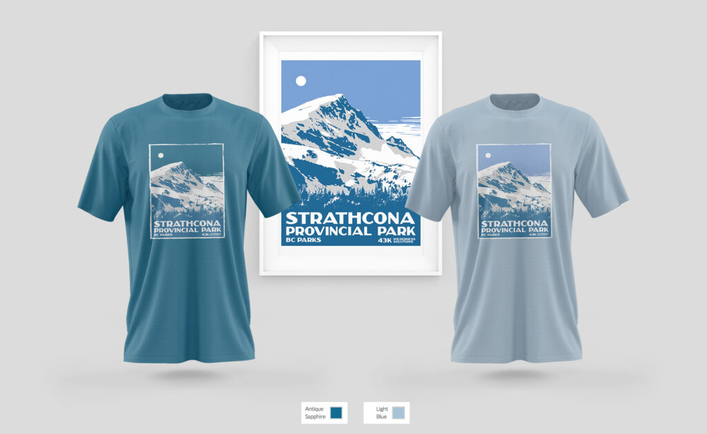
This was a fun project! I always loved that vintage style of posters, with 3 or 4 inks to make a landscape and I’m very glad to give this contest a try.
I searched a lot for pictures of the park. Found about Mountain Edward and it’s surroundings, and as the picture you wanted us to use was a bit hard to place in a vertical direction, I decided to frame the top of the mountain and just use pines trees to fill the picture. Then I choose a blue shade palette since the original pic seems to be taken on winter and it fitted more with the color palette from the old posters (Ice cave and Mountains).
Added some distressed textures to give it a more old like feeling and, just for the t-shirt design, used a grunge effect on the edges, so it can blend better with the shirt color (which is Carolina Blue, from the provider they already choose to print the shirts)
This was another time that even if I didn’t win the contest, they still ended up buying my design
